Colour of the Day: But make it make sense! BURGUNDY
First colour in what is going to be a ongoing series. I hope you find them useful!
It’s amazing what colour can do to a space. Burgundy is one of those colours that completely transforms a room the moment it’s applied, it feels instantly sumptuous the second it goes on the wall. It’s rich, grounding, sophisticated and full of quiet drama. It wraps a space with warmth in a few ways colours can.
This colour is incredible in dining rooms, snugs, hallways, and cloakrooms, anywhere you want atmosphere. It’s one of those tones that absolutely thrives at night, especially with warm lighting and candlelight. And if you’re someone who loves hanging artwork, this is the colour you use to give pieces a gallery-level backdrop.
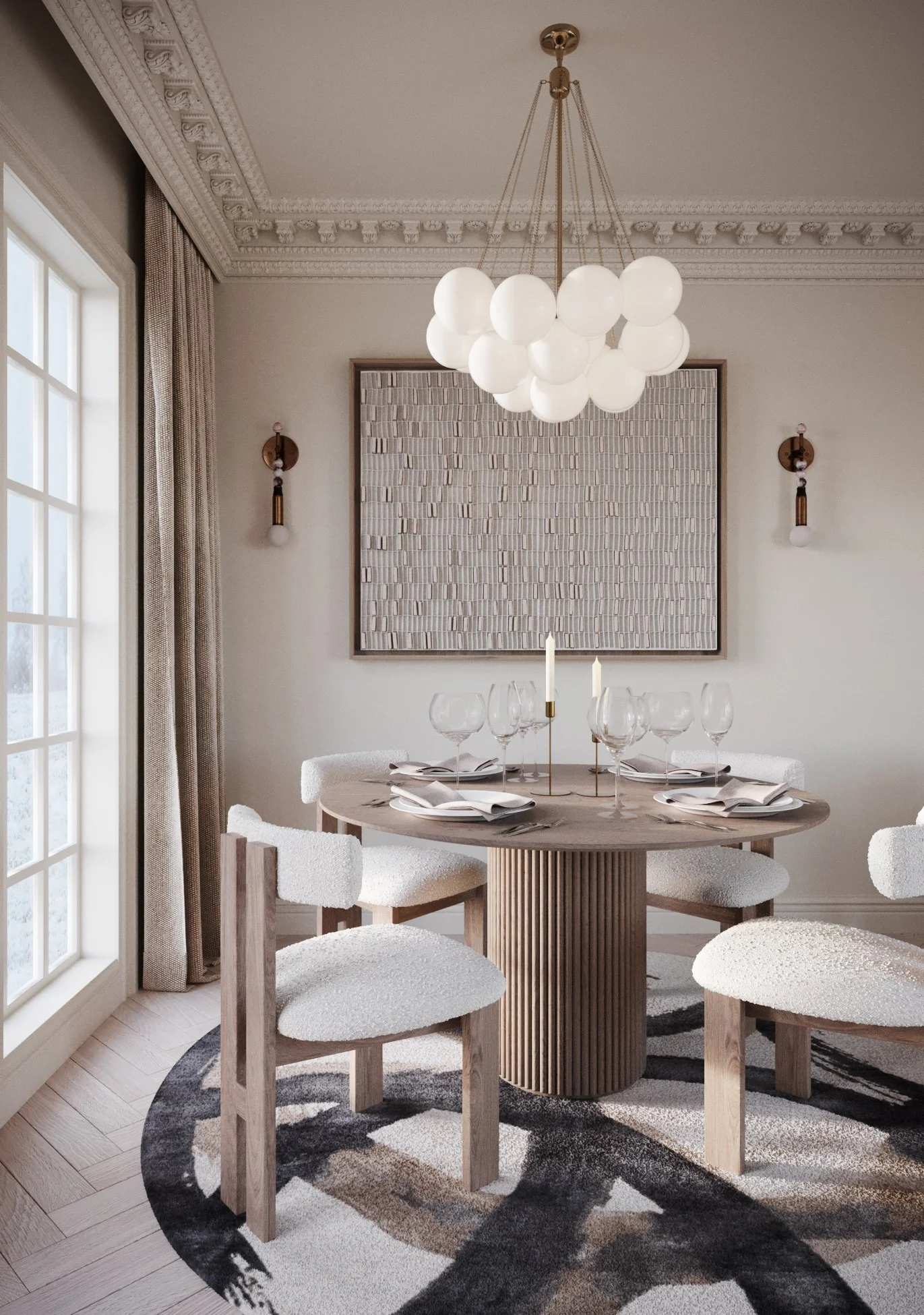
In this image below firstly I have used Alderman a warm neutral from Mylands so you can see the space before I add any Burgundy colours.

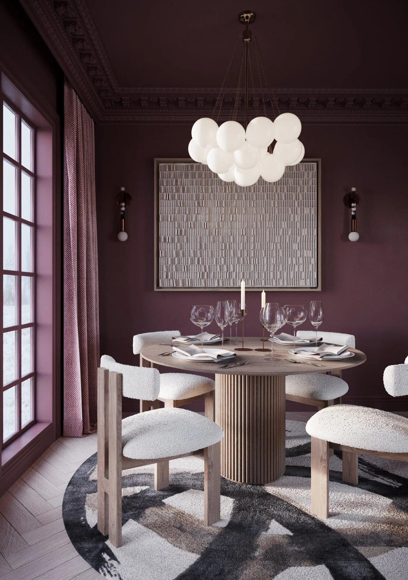
Here I have used Rothschild Street on the walls, Alderman on the ceiling, coving, skirting and woodwork. Both colours are from Mylands.
As you can see you the Burgundy colour really brings the room in and feels cocooning and intimate but without feeling overwhelming, which is why it’s a brilliant colour to use in dining rooms and snugs. It makes brass, bronze, and antique gold look incredibly luxurious, and enhances texture beautifully: velvet, linen, leather, panelling, embossed wallpapers - they all come alive against it.

You can use on the ceiling to make the ceiling feel lower, creating a intimate feel.

You can also carry the colour on the skirting and wood work to really bring the intimacy in.
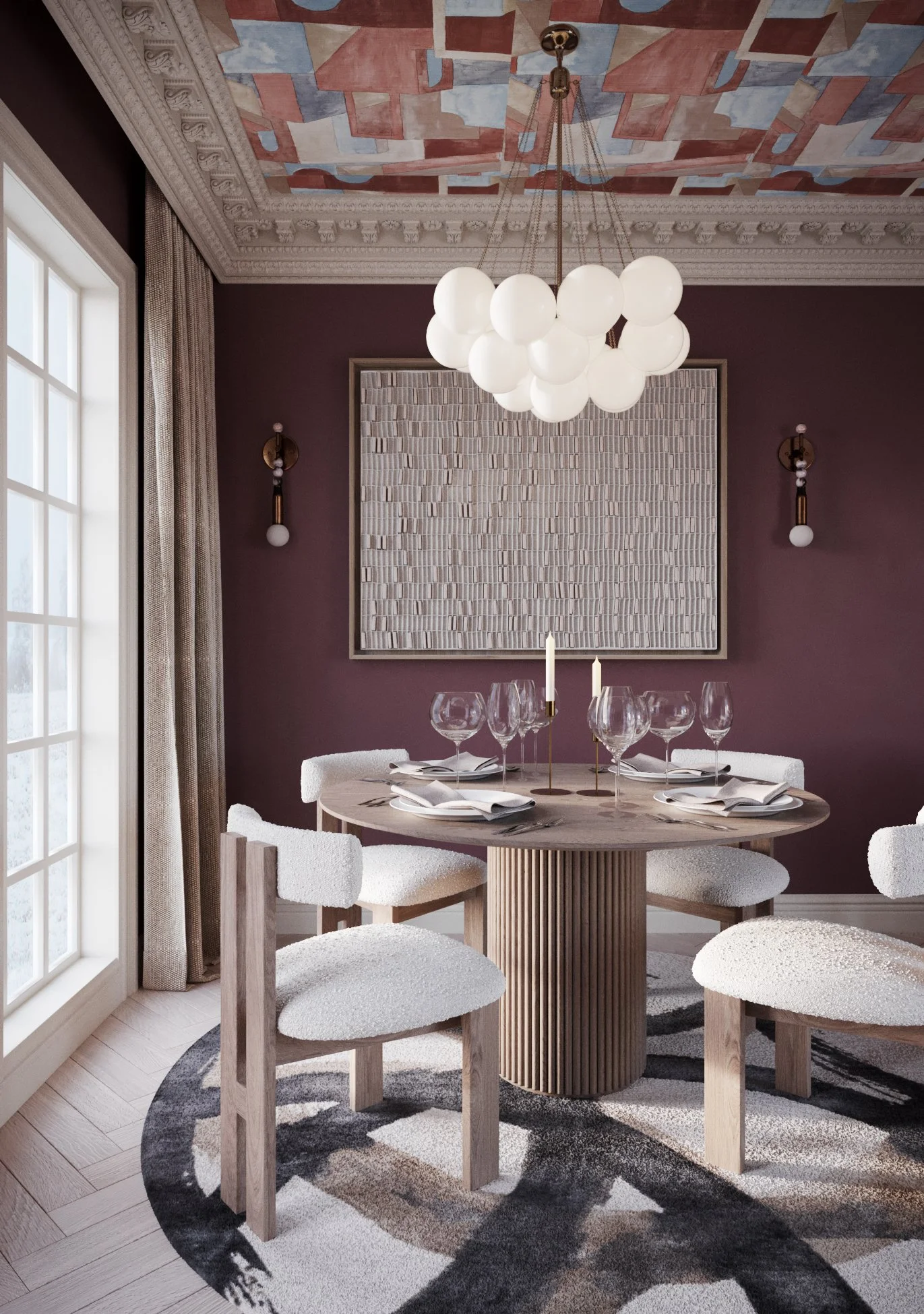
Or completely colour drench the space in Burgundy. This really makes it feel cocooning and intimate but not overwhelming. It definitely brings a bit of drama to the space!
The other option is, use it on the walls but pair it with a wallpaper that bring a bit of fun to the space.
Now, where it’s less successful.
Burgundy colours don’t love cool LED lighting, which can flatten it or make it look slightly bruised and muddy. Obviously if you arere trying to create a bright, fresh, airy feel - this isn’t the colour for that. It’s designed for intimacy, not breeziness. Also, be careful with orange-toned woods or pine, because the undertones can clash and push the whole room too warm.
Burgundy is dramatic, intimate, and quietly glamorous. It has this late-evening, glass-of-red-wine energy - rich, warm, and a little bit theatrical. It feels curated, artistic, and very intentionally designed. If you want a space that feels like a modern take on a classic club room, a gallery, or an atmospheric dining space then this colour is honestly perfection.
If you are looking for an interior designer or colour consultancy, whether that’s shaping a whole space, or simply finding the right balance between rooms, I’d love to chat.